Part 2 went up on April 28, 2025, right after the corn went in. I ended it with a list of things I wanted to fix and a promise that Part 3 would cover fertilizer application. That took a little longer than “the coming months,” because this project gets used basically twice a year (once during planting and once during sidedressing).
Before this season though, I decided to let Claude take a look at my existing code and try to fix what I couldnt get done last season. I suspect claude was pretty disappointed… anyhow… let’s talk about what it changed.
This is the sidedress side of the project: 28% UAN, seven rows on 30 inch spacing, and a monitor that I rebuilt almost from scratch this spring with Claude Code doing most of the typing. The hardware is nearly the same box from Part 1. Everything around it changed.
Five things exist now that did not exist when I wrote Part 2:
- Bluetooth, replacing the WiFi access point, so my phone keeps its internet connection while it’s reading flow.
- A native app on both iPhone and Android, installed from TestFlight and Play, instead of a web page served off the Pico.
- A portal running in my homelab that the app uploads every session to on its own, with the passes drawn on a satellite map of the field.
- A real calibration procedure, per sensor, done from the phone in the shop instead of trusting one number from a datasheet.
- Firmware updates over Bluetooth, so fixing something in the field no longer means walking a laptop to the tractor.
Here’s how each of those came about, starting with the promises I made you last April.
Scoring my own homework from Part 2
I listed five improvements at the end of the last post. Here’s where each one actually landed.
GPS speed, which flat out did not work. Fixed, by giving up on doing it on the Pico. The phone’s GPS is the speed source now and the Waveshare L76X hat is the backup, with a manual Auto / Phone / Device selector in the app for when I want to force one. That took its own detour: the speed would freeze the moment I switched away from the app to check the weather, which turned out to need a proper background location task rather than a foreground subscription.
Data logging with GPS coordinates for mapping analysis. Done, and it’s the part I use most. More on it below.
A sensor to detect whether the applicator is engaged. Solved, but I want to be straight about how: I said I’d add a sensor and instead I wrote a filter. Any reading under 0.05 GPM of total flow counts as not engaged. No extra hardware, and it fixes the “confusing zeros on the turns” complaint from Part 2 at the same time, because those turn readings are exactly what the filter drops.
Phone or smartwatch notifications. Half credit. The app alerts on a plugged row with haptic feedback in the cab, which covers the case I cared about. There’s no watch app.
A built in 10,000 to 15,000 mAh battery. Didn’t happen. It still runs off a USB power bank. Still on the list.
What the old one couldn’t do
The Part 1 build worked, and I don’t want to talk it down. It found a kinked hose on two rows and a plugged anti-siphon device on a fourth on the first day I used it, which is the whole reason to build one of these.
The limits were around the edges of that job. main.py was 521 lines and included a Microdot web server, because the Pico brought up its own WiFi access point and served a dashboard page to my phone. Joining that access point means the phone is off the internet, so I lost maps, radar and calls for as long as I was watching flow. Readings went to flow_data.csv on the Pico’s flash and stayed there until I walked a laptop to the shop. Calibration was one number, pulses_per_litre = 450, taken from the datasheet and applied to all six sensors as though six cheap turbine sensors agree with each other. And any change at all meant carrying a laptop to the tractor and running mpremote.
What changed this season
Three repositories moved between March 28 and June 14 of this year, most of it in four days in June.
Bluetooth instead of WiFi. On April 22 the web server came out. That commit deletes 5,689 lines and adds 1,892; most of the deletion is the vendored Microdot library and the HTML and JavaScript that went with it. In its place is a BLE service with separate characteristics for flow, GPS, status, configuration and cumulative pulse counts. Calibration went per row, seven values instead of one. The pulse counters became running totals rather than per-second rates, so a Bluetooth dropout mid-pass costs me a second of resolution instead of the gallons that went out during the gap.
A real app instead of a web page. It’s Expo and TypeScript with react-native-ble-plx and SQLite on the phone. Per-row gauges, plugged-row alerts, session logging, CSV export, and lbs of N per acre computed live from flow, ground speed and row spacing (28% UAN, 10.67 lbs per gallon, 28% N). It goes to my phone through TestFlight on iOS and Play internal testing on Android as a signed AAB, both built by my own Gitea Actions runner in the basement rather than a hosted build service. Two platforms, both native, neither one of them a browser tab pointed at a microcontroller.
Calibration you can actually perform. In Part 1 every sensor got 450 pulses per litre because that’s what the datasheet said. The app now has a catch test: pick a row, type in the volume you’re going to catch, hit Start, run fluid into a jug, hit Stop. The Pico reports cumulative pulse counts rather than just a rate, so the app diffs the count from start to stop, divides by the volume you actually caught, and writes that row’s own number back to the device over Bluetooth. Seven sensors, seven numbers, no laptop.
A seventh row. The applicator I sidedress with runs seven, so on June 11 the box picked up another channel on GPIO 10 and every Bluetooth message widened from six values to seven. Hold that thought.
A portal, which is the Part 2 promise I actually cared about. This is the piece that surprised me most, because it’s a small SaaS application and it runs entirely on my own hardware. Go with Postgres 16 and PostGIS on the back end, a Next.js front end with MapLibre for the maps, and a tile server, all in containers on a mini PC in the basement. Logins, an org for the farm, sessions, and sharing a field with someone else.
I don’t have to do anything to get data into it. When I hit Stop on a session, the app uploads it in the background; if I’m out of service it stays queued on the phone and goes up the next time I have a signal. Here’s a real session from June 13:
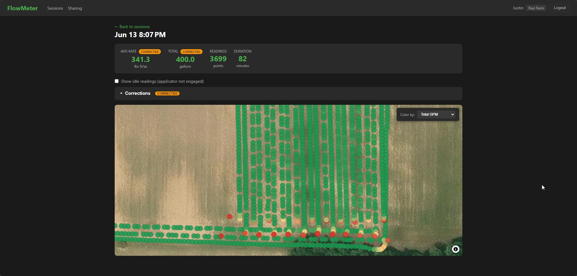
Every dot is one second of flow dropped at the GPS position where it happened, colored by total GPM. There are 3,699 of them across 82 minutes. The sensor samples once a second, so those two numbers shouldn’t match, and the gap is the twenty-odd minutes of that hour and a half spent turning, filling or sitting still. Those readings are hidden by default. There’s a checkbox to put them back when I want to see the whole track.
That color gradient is what I could never get out of a CSV. The orange and red along the bottom edge isn’t a plugged row, it’s the applicator coming out of the ground at the end of each pass while the GPS keeps logging. Zoom out and you can see the shape of the whole run:
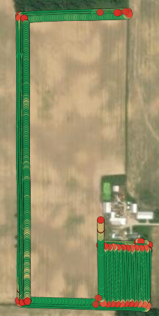
For comparison… this is what readings looked like last season before the help of AI
Red at every headland and every corner. Once you’ve looked at that, “hide the idle readings” stops being a nice-to-have and becomes the only way the map is readable, which is a much more convincing argument than the one I made for it in Part 2.
The two numbers at the top of that page carry a CORRECTED badge. That means I told the portal something about the session after the fact: rescale the volume to match what actually left the tank, or fill in a dead row’s flow from its neighbors. None of it touches the raw readings. Corrections live in their own tables keyed to the session and get applied when the page is read, so the original data is still underneath and a re-sync from the phone can’t wipe it out.
Firmware updates over Bluetooth. This is the piece I would never have built on my own, and it’s the one that fought hardest. First commit at 6:16 pm on June 11, working end to end on real hardware the evening of June 12. CI builds a signed bundle and publishes it; the phone downloads it whenever it has service and relays it over Bluetooth in a field that has none. The Pico keeps two copies of the app and boots through a small bootstrap that never changes: a freshly installed copy has to come up, run, and mark itself healthy, and one that crashes three times in a row gets rolled back to the version that worked. The manifest is Ed25519 signed and verified on the Pico itself, in pure MicroPython, because MicroPython ships neither SHA-512 nor a base64 module. Verification takes about 3 seconds. Eight firmware builds went out over those two days.
No more laptop in the cab.
Things that broke
The application rate was six times too high. This is the one that matters, so it goes first. The gallons-per-acre math divided total flow by one row’s spacing instead of the full width of the implement. Six rows at 1 GPM, 5 mph, 30 inch rows: the app showed 237.6 gallons per acre and 709 lbs of N per acre. The correct answers are 39.6 and 118. Six rows, six times high. And the unit test asserted 237.6, because the same session that wrote the bug wrote the test that agreed with it. It compiled, it passed, it put a confident number on the screen, and the only thing that was ever going to catch it was a person who knows roughly what a sidedress rate looks like.
iOS refuses to see one of my Bluetooth characteristics. The channel I built for bulk firmware data, the one ending in 0007, simply never appeared during service discovery. The diagnostic build finally printed what the phone could see: 0001, 0002, 0003, 0004, 0005, 0006, 0008. Everything except that one. I tried making it readable, tried adding a filler channel after it so it wasn’t last in the list, tried rotating the Bluetooth address so the phone couldn’t serve a cached copy (the Pico W won’t let you, it errors out whether the radio is on or off). The fix was to quit fighting: firmware data now rides on the control channel with a leading zero byte to tell it apart from the JSON commands. That channel is always discovered.
A 110 byte message arriving as 20 bytes. The device log read OTA ctrl raw: len=20 b'{"op":"begin","versi'. iOS quietly truncates a write larger than the negotiated packet size instead of splitting it, and the negotiated size was stuck at 23 bytes no matter what the Pico asked for. The fix is to chop every command into pieces sized to what the phone actually negotiated, and have the Pico glue them back together until the JSON parses.
A base64 encoder that emitted commas. The chunking code sliced buffers with subarray(). React Native’s buffer library hands back a plain byte array from that call, and its toString('base64') gives you comma separated numbers instead of base64. The Bluetooth library rejected the write before it ever left the phone. One wrapper function fixed it.
Android crashed the instant it got a GPS fix. Only on a real phone, only outside, only with a real fix, which is a wonderful combination for debugging. The background location task asks Android to persist a job across reboots, and Android kills any app that asks for that without declaring the boot permission. One line in the config fixed it; finding it took a local signed build and pulling the crash log off the phone over USB.
Row seven fell on the floor. The Pico sent seven flow values and the app stored six. The seventh row’s data was silently dropped on the way into the database for about a day. That’s the kind of bug you don’t find until you’re staring at the map wondering why it only ever draws six.
What the AI was good at, and what it wasn’t
Good at breadth. This went from a MicroPython script to a Go and PostGIS API, a map front end, a signed firmware update path with automatic rollback, an Ed25519 verifier written from scratch because the platform doesn’t have one, and two app store pipelines. In one spring, around planting. I would not have covered that much ground alone and I’m not going to pretend otherwise.
Bad at knowing what the number should be. Every bug in that list ran without erroring. The rate formula is the clean example: correct-looking code, a passing test, a plausible number on the screen, and a six-fold error. No amount of tooling had an opinion about it. That’s the split I’d give anyone thinking about working this way. It writes the thing fast. You still have to be the one who knows what right looks like, and on a fertilizer rate, being wrong is expensive in a way a web app never is.
What’s next
I built the catch test and then never ran it. All seven rows are still sitting at the datasheet’s 450 pulses per litre, which means every gallon figure on that map is only as good as a number I copied out of a PDF. That’s first on the list, sensor by sensor with a jug, because it’s the difference between a map that’s pretty and a map that’s true. After that, the battery I promised you in Part 2, and maybe feeding per-row application data into the other farm tools I’m building.
Same ask as last time. You don’t have to be a farmer or know anything about agriculture. If you think I’ve made a silly design choice, or there’s a better way to do a piece of this, let me know in the comments.